Communicating effectively with data is a challenge many businesses face. There are opportunities to tell compelling stories with data, yet the strategic advantage that can be gained through good communication is often missed. In some cases, data isn’t used at all when it could help make a stronger point, while in other cases the data that is included confuses more than it informs.
Why does this happen? No one really teaches us how to tell a story with data, so we end up relying on our tools to understand best practices. And our tools often lead us in the wrong direction. The next time you find yourself needing to communicate with data--whether as part of a business plan, to communicate to your customers or stakeholders, or for some other purpose, consider follow these five tips for success:
1. Keep your audience top of mind. Everything you’re doing is for your audience, so keep who they are and their needs in mind throughout the process, from figuring out what you want to communicate, to determining what data to show, to deciding how to show it, where to draw attention, and what story to form with it. Make it extra clear to your audience what’s in it for them, what you want them to know, and why they should care.
2. Choose a visual format that makes sense. Line graphs are great for showing trends over time and bar charts are good for comparing categorical data. Pie charts (and area charts in general) are hard for people to read because our eyes don’t naturally do a good job measuring angles and areas, so be cautious when using them. When choosing between a common chart type like a bar chart and something less common, my recommendation is generally for the common chart. It means less of a learning curve for your audience so they can more easily grasp the information you’re providing.
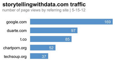
3. Resist the temptation to dress up your data. 3D, meaningless color, background shading: these distract from your data by adding clutter without adding informative value. When you’ve found the right angle -- the right way to make your data compelling for your audience -- there’s no need to dress it up because the data itself becomes inherently interesting.
Use this:
Instead of this:
4. Draw attention to the important parts of your visual. Color, size and position on the page are some of the easiest and most powerful ways to draw your audience’s attention to different parts of your visual. Don’t use color just to make things colorful; use it sparingly and strategically to draw your audience’s attention to where you want them to focus. If something is more important, make it big and place it in a higher priority place on the page (since in Western cultures most people read left to right and top to bottom, the top left of the page is precious real estate--make it count!). Also think of using color and size to create a visual hierarchy on the page. This is a way to let your audience into your head via visual cues so they know what is most important and where they should focus first, second, and so on.
5. Tell a story. Stories have a way of focusing your audience’s attention and helping them understand why the data you are showing is relevant and important. I think of stories in terms of plot, twists, and ending: the plot is the context that is essential for your audience to know, the twists are the findings and what make your story compelling, and the ending is the call to action--what you need your audience to know and do. If you have a recommendation, state it clearly in words in your communication.
When used well, data can add credibility where we lack it, impart new knowledge, persuade people to support your vision, demonstrate impact, or help convince someone to take action. But it is not enough simply to show data; rather, I challenge you to use the tips outlined above to tell a story with data.
Ready to try it out? Learn more about creating charts and graphs using Google Spreadsheets and how you can customize them based on our tips. For related info, check out www.storytellingwithdata.com.


Tidak ada komentar:
Posting Komentar